1 · The painted-door subscription test
Situation
Paywall strategy needed to know whether readers would pay for subscriptions — but no subscription product existed, so there was no behavioural data at all. Opinion filled the vacuum: every stakeholder had a different instinct about which audiences would convert.
Design
A painted-door experiment: show a realistic subscription prompt to a controlled sample, measure genuine click-through intent by audience segment, and be honest on the other side of the door about the product not existing yet. The design conversation was mostly about ethics and sample integrity — capping exposure per user, excluding logged-out churners, and pre-registering which segments we'd read out so nobody could fish for a positive result afterwards.
Readout
Intent was heavily concentrated: loyal, habitual readers showed a step-change more interest than every other segment, while search-referred traffic — the bulk of raw volume — showed almost none. Crucially, the gap between segments was far larger than any plausible measurement error, which is what made the result decision-grade despite the door being painted.
Decision
Paywall strategy got its first concrete demand signal: size the opportunity on the loyal-reader base, not on total traffic. That reframing changed the revenue model conversation from "what percentage of 65 sites' traffic converts?" to "how many habitual readers do we actually have, and where?"
2 · The engagement programme readout
Situation
A rolling programme of registration prompts, content gating and engagement experiments across 65+ national and regional titles — 10–20 live experiments a month, each needing a go / iterate / stop call, with results that were often noisy and occasionally contradicted each other between titles.
Design
The unit of work here wasn't a single test but the readout discipline: pre-agreed primary metrics, significance checked post-hoc in BigQuery rather than trusted from the testing tool's dashboard, and conflicting title-level results reconciled by separating signal from variance before anyone saw a headline number. The recommendation was always one of three words — go, iterate, stop — with the evidence attached.
Readout
Individually, most wins were small — fractions of a percent. Compounded across a year of shipped go decisions (and, just as importantly, stopped losers), the programme contributed to a ~5% uplift in yearly pageviews, worth an estimated £50K+ in incremental ad revenue.
Decision
Beyond the number, the durable outcome was cultural: product managers stopped asking "did the test win?" and started asking "what's the readout?" — which is the difference between a testing tool and a testing culture.
3 · The Bookmark feature case
Situation
A reader-facing Bookmark feature was on the roadmap bubble — plausible, likeable, and completely unproven. It needed either a case or a burial.
Design
I built the analytical case before the build: sized the returning-reader audience that would plausibly use it, defined what success would look like post-launch (repeat usage and return-visit behaviour, not raw taps), and set up the rollout analysis so the launch decision and the keep decision were separate questions with separate evidence.
Readout
Post-launch behaviour matched the case: usage grew week on week among exactly the returning-reader segment the case predicted, with bookmark users showing the stronger return-visit pattern the feature was meant to reinforce.
Decision
Shipped, kept, and still live today. It remains my favourite kind of analyst work: the feature exists because the case held, and stayed because the readout did.
4 · The one you can check yourself
Situation
The three studies above have the problem every analyst's portfolio has: you have to take my word for them. Client data is anonymised, chart values are illustrative, and the pre-registration that made the readout honest lives in somebody else's Confluence. So I built a product of my own and ran a real experiment on it in the open.
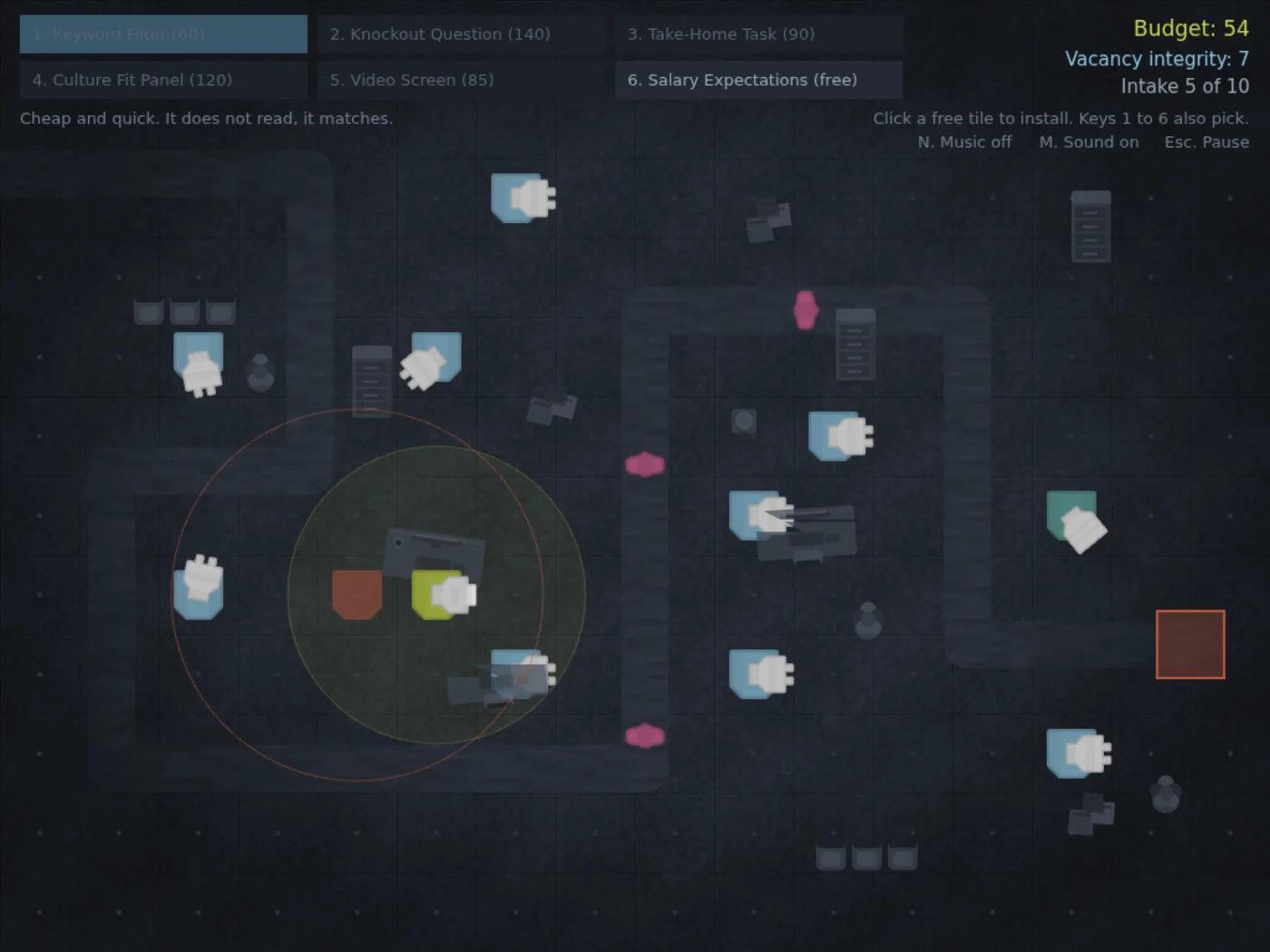
The product is ATS Defence — a browser tower defence game where you play the applicant tracking system, placing Keyword Filters and Knockout Questions to reject applicants before one of them reaches the vacancy and a human has to read it properly. Phaser and Vite in the browser, Supabase behind Netlify functions, GrowthBook doing assignment.
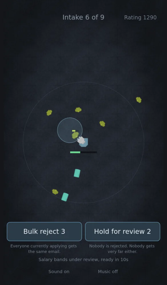
It runs on a desktop and on a phone, and the phone gets a different game rather than a smaller one. The three landscape boards are about where to put the screening; the portrait board fixes one screening process dead centre, sends the applicants at it from every direction, and takes away every input during an intake — the only decision is which of two improvements to accept between them.
Design
The question was whether opening the game with a busier first wave keeps players in it. The worry was concrete: wave one is five applicants over eight seconds, quiet enough that a player might decide nothing is happening and close the tab. Two arms, split 50/50 on a stable anonymous id, waves two onwards identical — the test is about how the game opens, not how it goes on.
Primary metric is the wave-by-wave survival curve, read as a shape rather than a single number. Secondary is early abandonment. Guardrail is the proportion of runs that reach wave ten, because a busy opening that improves retention by making the game easier to lose early is not a win worth having. Thirteen events carried it at launch — fifteen now, and the phone board is deliberately outside the test, since the arm being compared is a wave list only the classic board plays. The SQL that produces the readout is committed alongside the design, so the numbers are the same ones every time somebody runs them.
Readout
The instrumentation earned its keep before the experiment did. The first real run through the collector exposed a bug in the abandonment tracking — the event was firing the moment a player glanced at another tab, and since it fires once per run, their actual exit then went unrecorded. Left alone it would have quietly ruined the secondary metric. Tab-hiding now starts a thirty-second clock that cancels if they come back, and the reason is recorded so a departure can be told from a glance.
The pre-registration also states, before launch, that the experiment is probably underpowered: detecting a 10-point difference in abandonment needs roughly 340 assigned runs per arm, and a LinkedIn launch post is unlikely to produce that. The likely honest outcome is "inconclusive, and here is the confidence interval" — which is the outcome that will be written up.
Decision
At the stopping point — 340 runs per arm or fourteen days, whichever comes first — the experiment is turned off, wave one is set to whichever arm the data favours, and left on control if it favours neither. No interim peeking; the numbers get looked at once.
That last part is the whole point of including this one. Writing down "I expect this to be inconclusive and I will report it as inconclusive" before collecting a single event is the discipline the three studies above were run with, and here it is in a public repository with a timestamp on it.
Desktop, tablet and phone. On a touchscreen the hover a mouse uses to preview a tower's range becomes a drag: the preview follows your finger and the tower lands where it lifts. Below 900 by 600 the screen gets the portrait board instead.
How I'd do this for you
Every study above follows the same shape — frame the question before touching data, pre-commit the readout, separate signal from variance, and end on a one-word recommendation with evidence attached. If your experimentation programme produces results people argue about instead of decisions people act on, that's the gap I fill.